

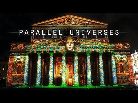
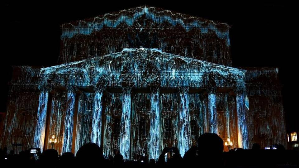
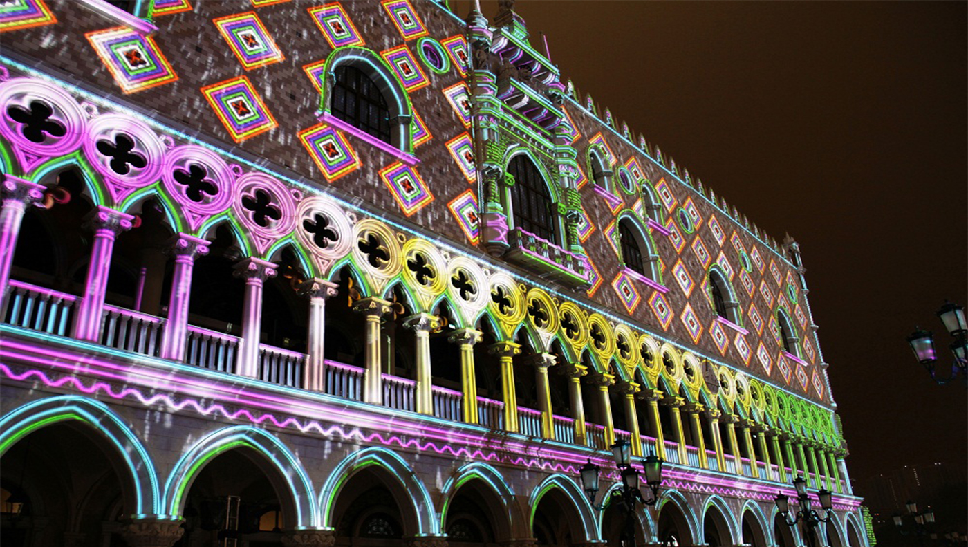
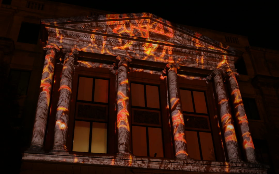
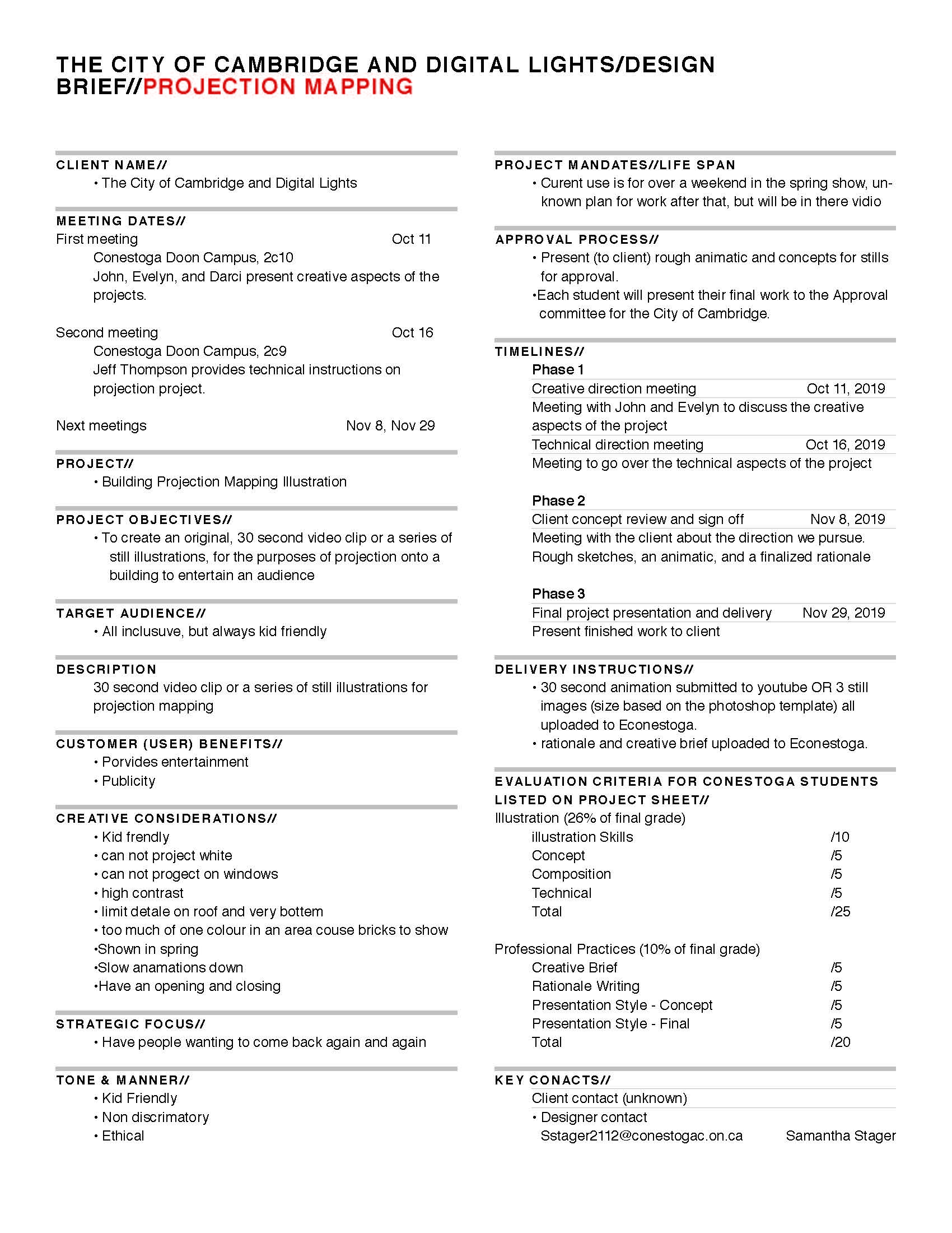
Project Brief
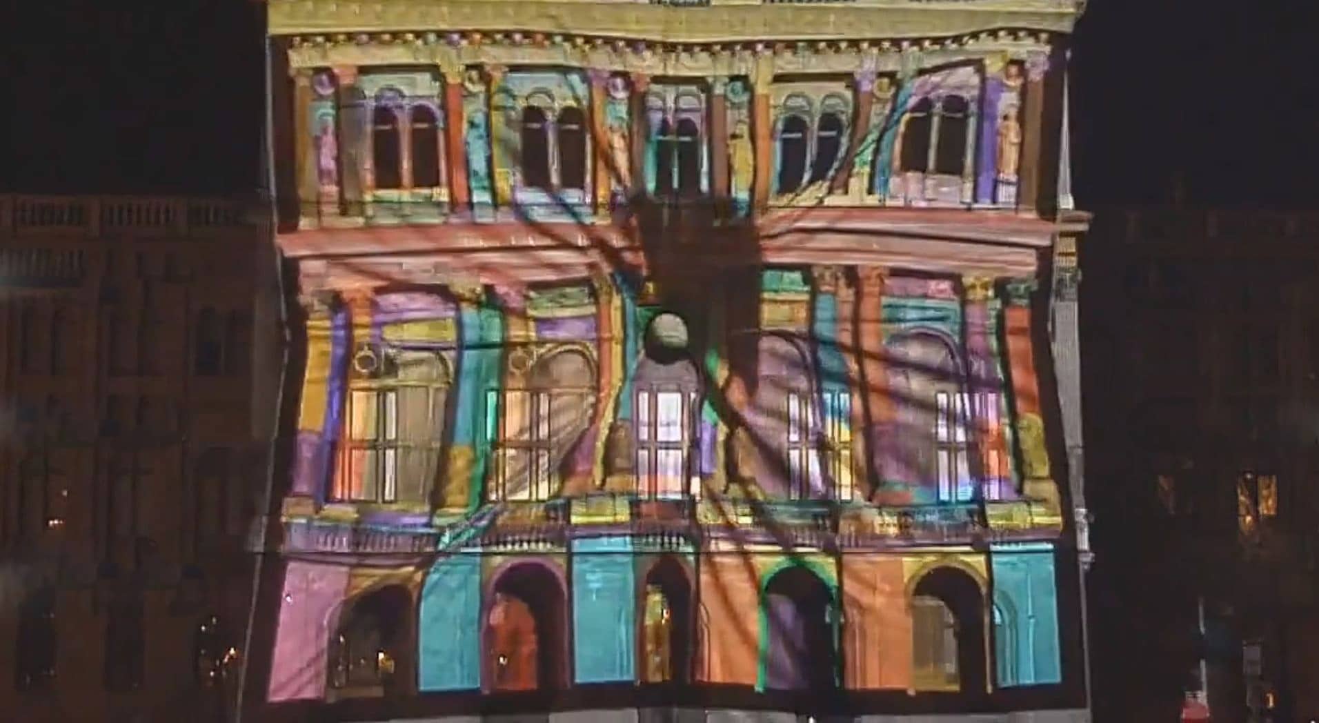
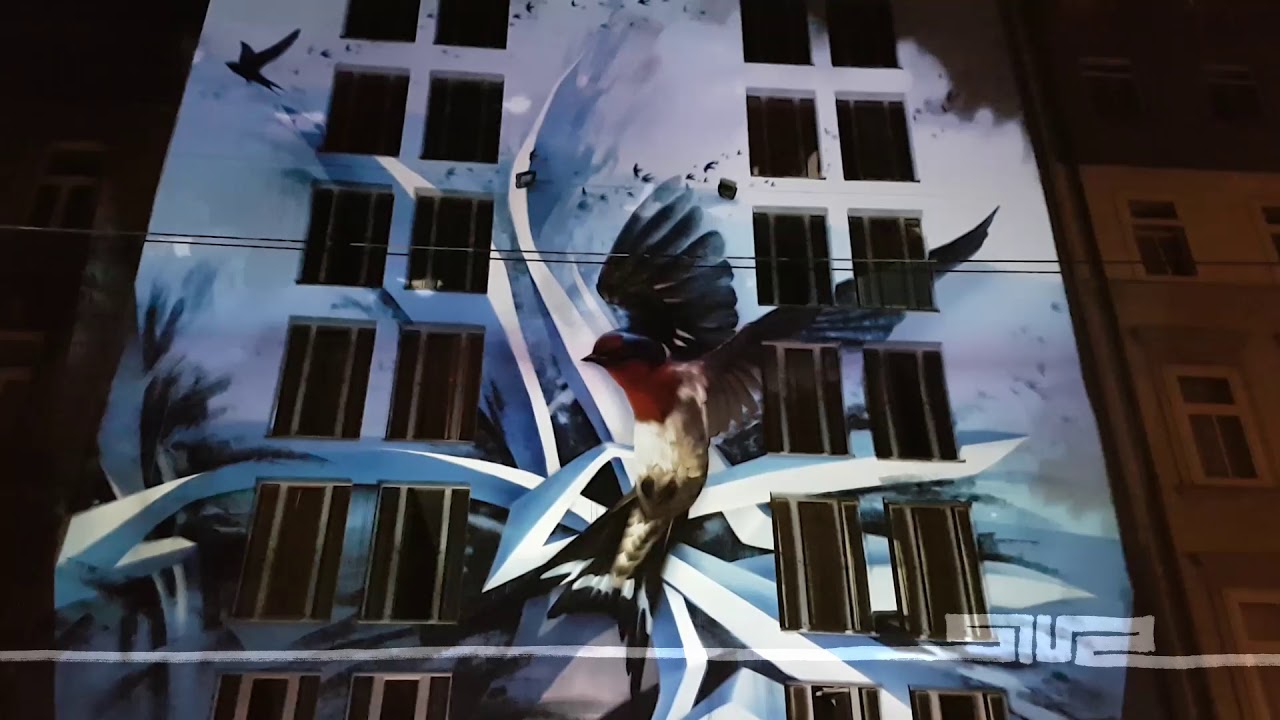
We had to create a 30 second video clip or a series of still illustrations, for the purposes of projection onto a building. First we had to start to build a mood board for what our particular clip might look like. Then we created a series of thumbnails and concepts that we presented to the client, from those concepts they chose what we went forward with. From that we created a 30 second animated clip that they can project onto their building.
Mood Board
Creative Brief
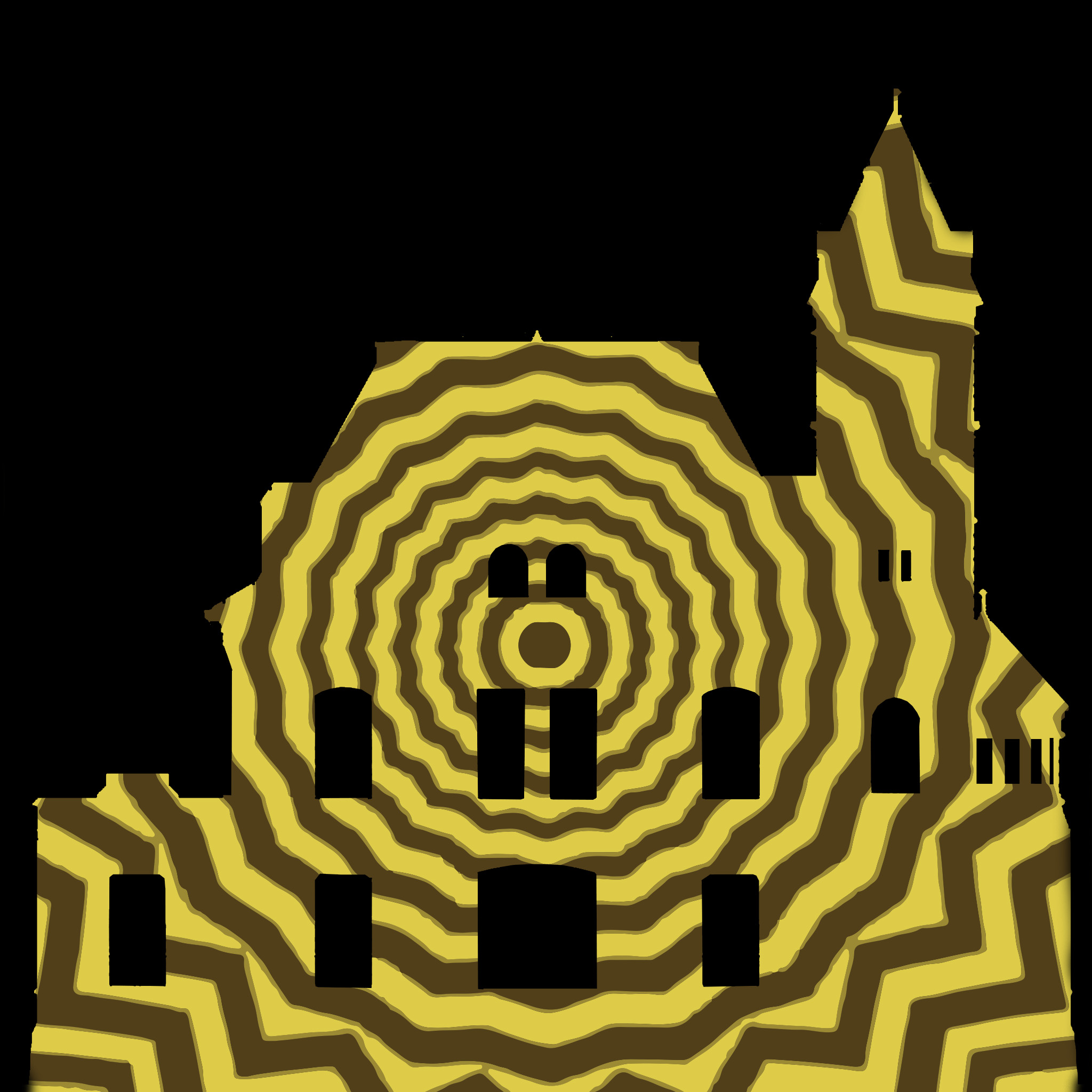
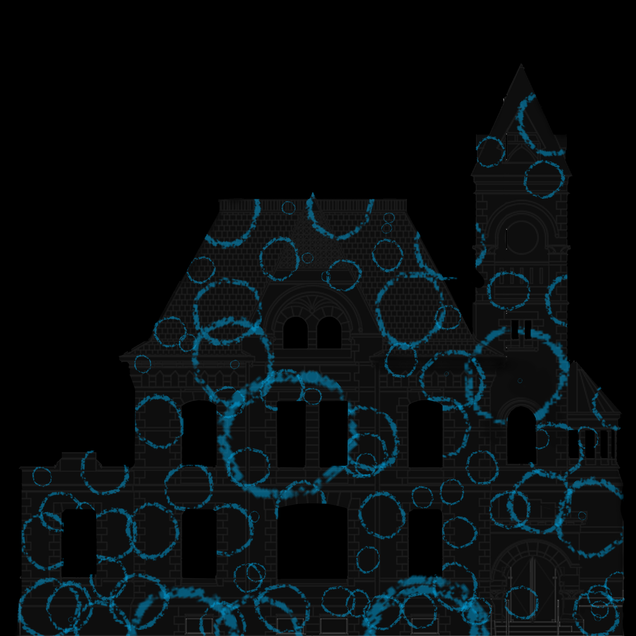
Concepts
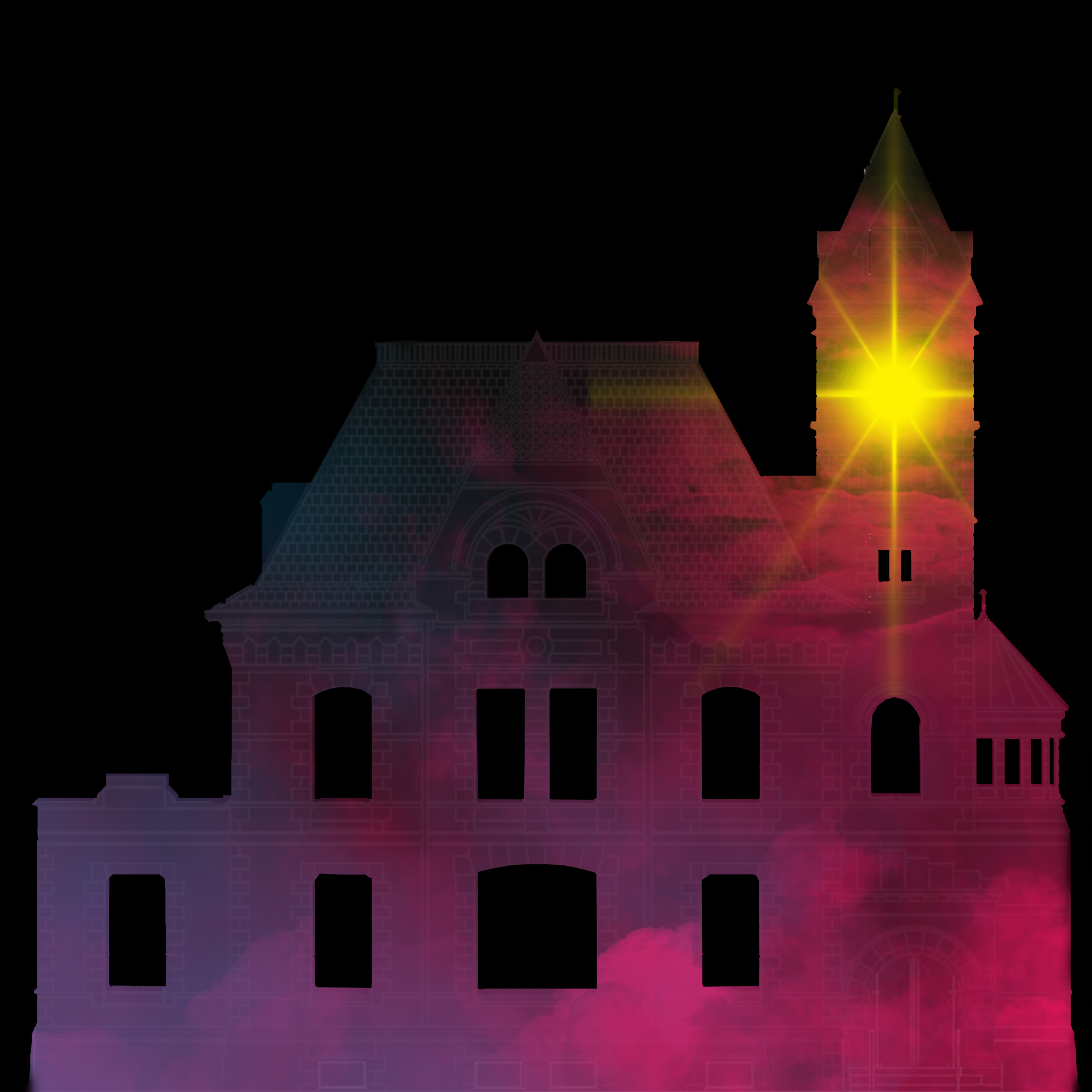
Finale Animation
Rastional
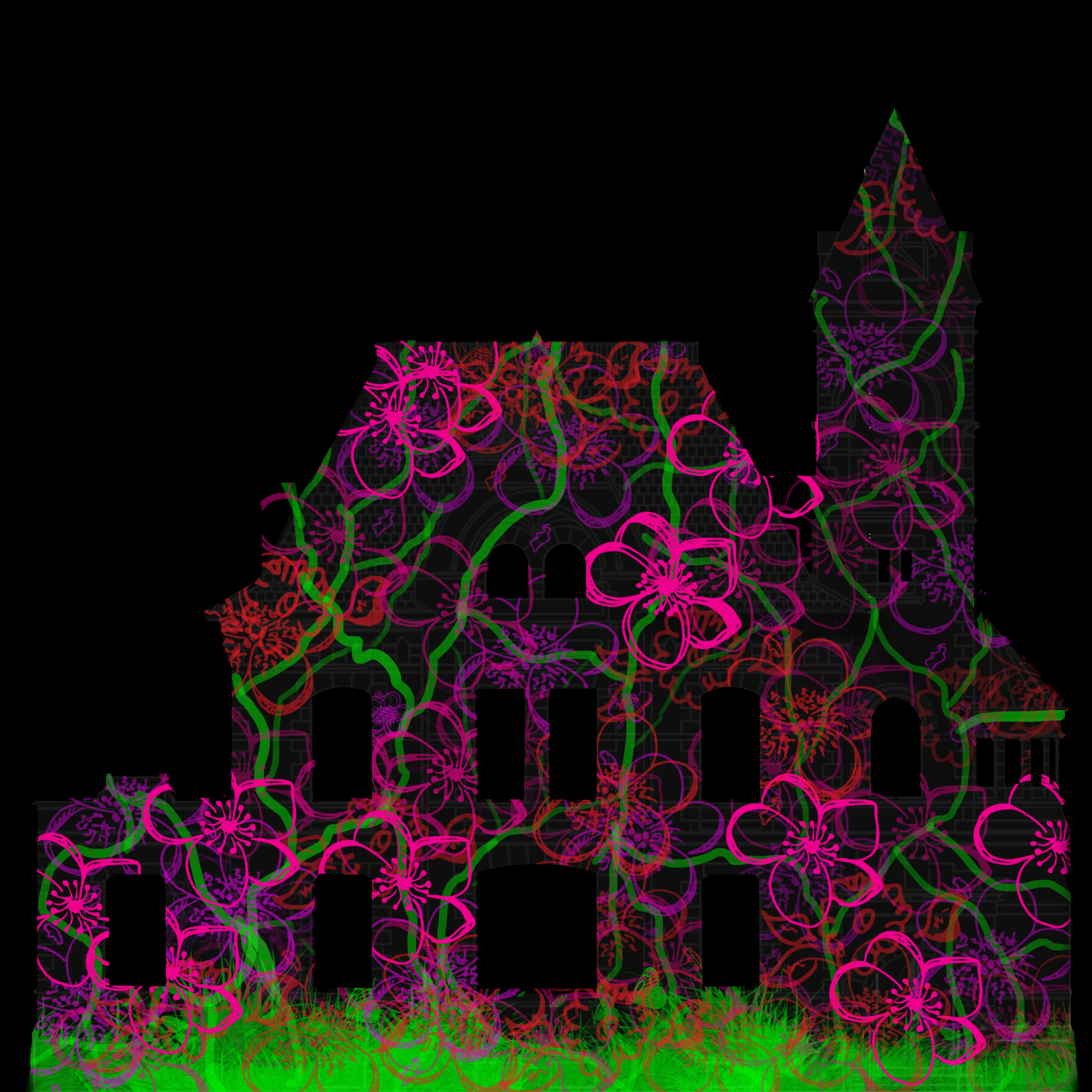
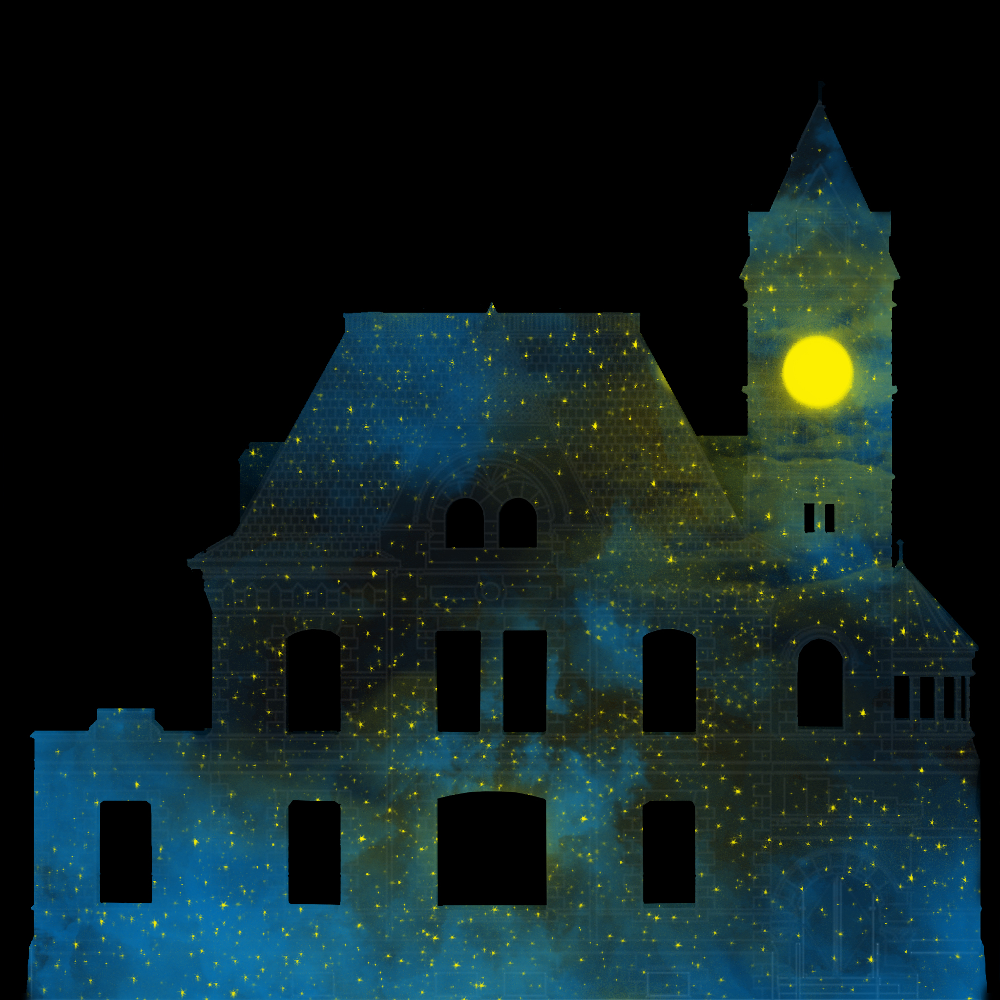
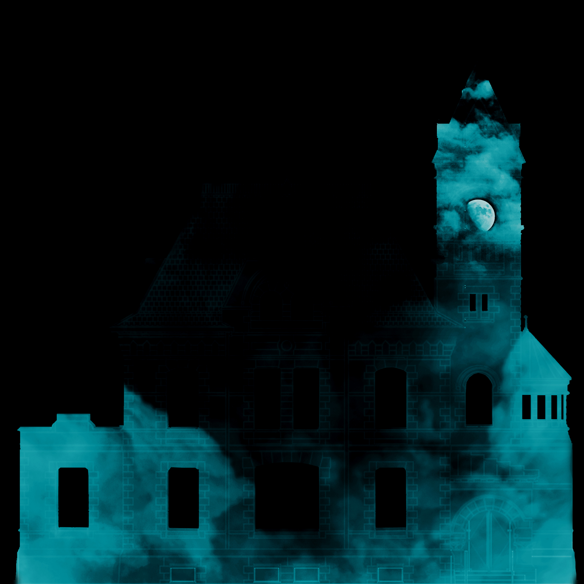
The piece I made that was selected, was a still of the sun where the clock is and clouds around, creating a sky seen. What made this piece really stand out to them was the colors, bright pink, purple, blue, and yellow. Why I thought that this could be a good thing to project was that it followed a lot of there points; its kid friendly, bright saturated colours, good contrast, would still look realistic at a faster speed. Also I find the colours work well with the spring theme. What they recommended that I did was to turn my still into an animation. To do that they suggested that I have the clouds move, and create some depth by having some go in front of the sun. Since they said they really like the colours they wanted me to keep them similar, but suggested possibly having the colours and lighting change threw out. So going with their suggestions I created an animation with clouds that look like there coming towards you. I decided to have the clouds come towards you instead of going from one side to the other, because the clients stated that the audience reacts well to visual illusions. Well doing my animation I also decided to take a more realistic approach, making it look less cartoony but keeping the colours that give it a more fun and fairy tale like affect. The reason I decided to do this is because I haven't seen much realistic art in the projection examples, hopefully in doing so it allows my piece to stand out. To finish it off I added a fade in and out to allow for easier transition between pieces. Overall all, I'm quite proud of my peace, especially since this one of my first times using after effects.